
Last updated: July 27, 2020
Math Skill: Interpreting circle graphs (converting percentages to fractions and decimals)
Science Subject: Our Energy Resources
Area level: State-scale
Environmental Area: Energy
Purpose: Understand primary energy sources in Indiana and develop awareness of our energy use
BACKGROUND FOR THE TEACHER
Our states consumes 2ndlargest amount of coal in this country in 2018, only after Texas. Accordingly, the share of coal in total energy consumption is large. About 40% of our energy comes from coal in Indiana.
Together with coal, natural gas and petroleum also play an important role in Indiana. As large as 92% of our energy comes from coal, natural gas, and petroleum, which are called fossil fuels. The share of renewable energy is 8%.
The energy consumption pattern in our state is significantly different from that in California, which has little or no coal reserves. About half of total energy consumption is supported by petroleum in California. The share of fossil fuels is 81% and renewable energy consists of 16% of total energy consumption in California.
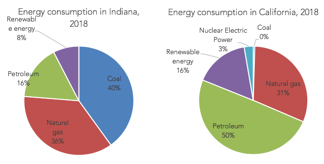
Left: Primary energy consumption by source in Indiana in 2018 (Source: U.S. EIA) Right: Primary energy consumption by source in California in 2018 (Source: U.S. EIA)
1) Energy in Indiana 2) Our energy sources 3) Who supplies energy to Evansville?


TEACHER GUIDE
The purpose of this activity is to enhance students’ skills in interpreting circle graphs. Using the information on how much of our energy comes from which energy source in our state, this activity provides 2 worksheets depending on students’ understanding levels. The circle graph used in this activity was created based on data obtained from the U.S. Energy Information Administration.
Worksheet & answer key
Math Skill: Interpreting circle graphs (converting percents to fractions and decimals)
Using the circle graph on primary energy consumption by source in Indiana in 2018, students are asked to use skills in converting percents to fractions and decimals.


related problem
Math Skill: Interpreting circle graphs (number comparison)
Using the circle graph on primary energy consumption by source in Indiana in 2018, students are asked to find out which portion is the largest/smallest. The graph uses percentage to show the size of each portion.


