Last updated: October 28, 2021
Math Skill: Interpreting line graphs (3-digit numbers)
Science Area: Pollution / Weather and Climate
Grade level: 3rd – 4th – 5th grades
Area level: State-scale
Environmental Area: Air / Climate change
Purpose: Understand trends of CO2 emissions in Indiana over the last decade and develop awareness of greenhouse gas emissions
BACKGROUND FOR THE TEACHER
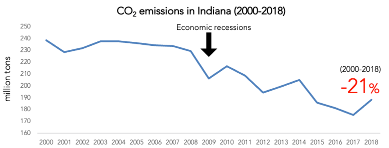
The amount of CO2 in Indiana had decreased by more than 20% since 2000 and that in 2017 was the lowest over the last 30 years. Our state released 191 million metric tons of carbon and ranked 7th in the nation in 2018 (U.S.EIA).
The electric power sector is responsible for about 50% of the total CO2 emissions in Indiana.

(Source: U.S. EIA, Table 4)
The main reason that the electric power sector occupies the largest portion is that Indiana depends majority, which is more than 90%, of its energy on fossil fuels –coal, natural gas, and petroleum.

(Source: U.S. EIA)
In particular, the use of coal for electricity generation is closely linked to the amount of CO2 emissions in the state. Indiana uses large amounts of coal for electricity generation and ranked third in coal consumption only after Texas and Missouri in 2020 (U.S. EIA). Coal produces the largest CO2 when combusted, almost double the amount from natural gas (U.S.EIA).
 (Source: U.S. EIA)
Climate change and Greenhouse Gas Effect


TEACHER GUIDE
The purpose of this activity is to improve students’ skills in interpreting line graphs by using a graph that shows trends of CO2 emissions in Indiana since 2008 . Through reading the graph, students will understand the idea that how CO2e missions in their state has been changing over the last 11 years.
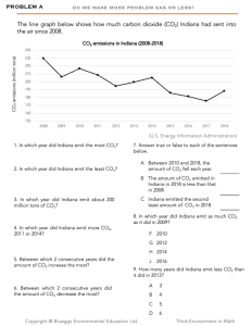
Worksheets & answer key
Math Skill: Interpreting line graphs (3-digit numbers)
The line graph shows trends in CO2 emissions in Indiana during 2008 and 2018. Students complete questions related to the graph. They will compare 3-digit numbers to interpret the line graphs. The graph was created using the data provided from U.S. Energy Information Administration (U.S. EIA, Table 2).